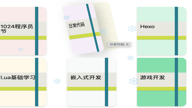
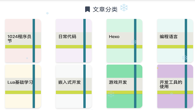
After switching to the Matery theme, I customized its category page so each category looks like an animated notebook.
![Notebook-style category cards]()
![Category card hover effect]()
Theme internals can change between releases. Commit or back up the theme before editing it, and reapply the customization carefully after upgrades.
Replace the category markup
Open layout/category-cloud.ejs. Replace the original category chip with this structure while retaining the surrounding link generated by the theme:
1
2
3
4
5
6
7
8
9
10
11
12
13
14
15
16
17
18
19
20
21
| <div class="moleskine-wrapper">
<div class="moleskine-notebook">
<div class="chip notebook-cover center-align waves-effect waves-light
<% if (isCategory && category.name == page.category) { %>
chip-active
<% } else { %>
chip-default
<% } %>"
style="background-color: <%- color %>;">
<div class="notebook-skin
<% if (isCategory && category.name == page.category) { %>
chip-active
<% } else { %>
chip-default
<% } %>">
<%- category.name %>
</div>
</div>
<div class="notebook-page dotted"></div>
</div>
</div>
|
Add the notebook styles
Place the CSS in the theme’s custom stylesheet when one is available, rather than embedding it directly in the template:
1
2
3
4
5
6
7
8
9
10
11
12
13
14
15
16
17
18
19
20
21
22
23
24
25
26
27
28
29
30
31
32
33
34
35
36
37
38
39
40
41
42
43
44
45
46
47
48
49
50
51
52
53
54
55
56
57
58
59
60
61
62
63
64
65
66
67
68
69
70
71
72
73
74
75
76
77
78
79
80
81
82
83
84
85
86
87
88
89
90
91
92
93
94
95
96
97
98
99
| .chip-container .tag-chips {
display: flex;
flex-wrap: wrap;
justify-content: space-around;
}
.moleskine-wrapper {
min-width: 10em;
max-width: 25%;
}
.moleskine-notebook {
position: relative;
display: flex;
height: 200px;
border-radius: 5px 15px 15px 5px;
transform-origin: left center;
transition: transform .5s linear;
}
.notebook-cover {
position: absolute;
z-index: 10;
width: 140px;
height: 200px;
border-radius: 5px 15px 15px 5px;
transform-origin: left center;
transform-style: preserve-3d;
transition: transform .5s linear, box-shadow .5s linear;
}
.notebook-cover::before {
content: "";
position: absolute;
top: -1px;
right: 25px;
width: 10px;
height: calc(100% + 2px);
border-radius: 2px;
background: repeating-linear-gradient(
90deg,
#1e606e 0,
#2e95aa 12%,
#1e606e 25%
);
}
.notebook-skin {
position: relative;
z-index: 10;
box-sizing: border-box;
width: 100%;
height: 74px;
margin-top: 42px;
padding: 10px 32px 10px 10px;
background: #e8e8e0;
color: #222;
font-size: 19px;
text-align: left;
}
.notebook-skin::before {
content: "";
position: absolute;
right: 0;
bottom: 0;
left: 0;
height: 15px;
background: #cddc39;
}
.notebook-page {
position: absolute;
top: 10px;
width: 140px;
height: 100%;
border-radius: 5px 16px 16px 5px;
background: #fbfae8;
}
.notebook-page.dotted {
background: repeating-linear-gradient(
to bottom,
#fbfae8 0,
#fbfae8 9px,
#e4e4e4 9px,
#e4e4e4 10px
);
}
.moleskine-notebook:hover {
transform: rotateZ(-10deg);
}
.moleskine-notebook:hover .notebook-cover {
z-index: 99;
transform: rotateY(-50deg);
box-shadow: 20px 10px 50px rgba(0, 0, 0, .2);
}
|
Adjust the active and hover colors in source/css/matery.css to match the rest of your site. Rebuild Hexo and test both desktop and mobile widths.
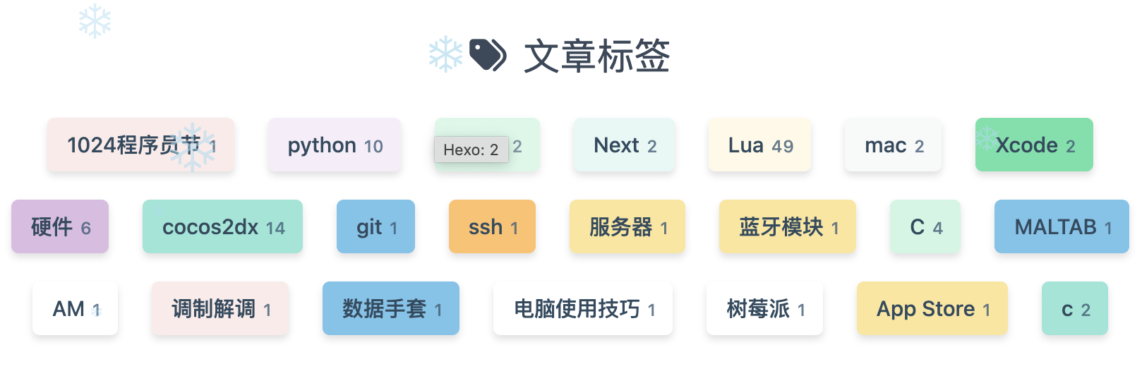
![Customized tag colors]()
Original inspiration